Using the content module to design your email campaign
The following content modules are available for you
to use when designing your
email campaign:
Tip: Click the icon below to view detailed
instructions.

|
Add a block of text using one or two columns,
and insert links, tags, and images. |

|
Choose from four layouts featuring an
image with optional overlapping text. |

|
Choose from layouts featuring an image
and a block of text. |

|
Add an actionable button to your email
message. |

|
Choose from four layouts, an image, a
heading, block of text, actionable button, and contact information. |

|
Choose from four layouts featuring a product
image, product name, block of text, and price. |

|
Choose from two layouts featuring an image,
heading, and a block of text. |

|
Choose from four layouts featuring a product
image, a heading, two blocks of text, and actionable button. |

|
Choose from three layouts to display a
text testimonial with a customer photo. |

|
Configure image and business information
that appears at the top of your email message, including: logo,
phone number, and address. |

|
Configure business information, links,
and affiliation that appears at the bottom of your email message. |

|
Insert your own HTML code to create a
customized module of information including graphics, logos, text,
and so forth. |
The following sections provide instructions on configuring
and customizing each type of module in Campaign Studio.
To
use the Text module

1. Move
your mouse over the top-right of a module surrounding text, and click
the pencil icon to choose a Layout
or Background Color for
the text.

2. Click
Done.
3. Move
your mouse directly over any text you want to edit, and click the pencil
icon to edit and format the text.

4. Use
the Rich Text Module settings
panel on the left to edit and format the text you select on the right:
Note: Make
sure to select the specific text that you'd like to change in order for
your changes to apply.
· Format - Style (bold, italics, underline,
bullets), Alignment, Font Size
· Font - Choose from a list of
web safe fonts.
· Color - Click the color circle
to change the text color.
Tip: To add
a new color, click the Add Custom Colors button, then the pencil icon
under the circle to select a color.
· Insert - Add a link, Custom
Tag, or Image.
Note: It
will be inserted wherever the mouse cursor is located on the right-side
within the module.
5. Click
Done.
To
use the Image module

1. Move
your mouse over the top-right of the Image Module, and click the pencil
icon to edit the layout and image.

2. Click
Style, and select a Layout to
determine how the text and image will overlap, then choose a Background
Color for the container.
3. Move
your mouse over the image and click Change
Image to upload a new photo or select from the Image Gallery.

4. Click
Done.
To
use the Featured Content module

1. Move
your mouse over the top-right of the Featured Content Module, and click
the pencil icon to edit the Layout and Image.
a. Configure
the layout by clicking one of the four available Layout
templates to the left side of the module.
b. Choose
a Background Color from the color
samples on the left side, or click +Add
Custom Colors to insert your own.
2. Move
your mouse directly over any text, and click the pencil icon to edit and
format the text using the Rich Text Module.
3. Click
the Image tab on the left to change
the image in the Featured Content Module.
Note: You
can choose from an image you upload or select one from the Image Gallery.
4. Click
Done.
5. If
you've selected a layout with a button,
click the Button tab on the left-side
of the module to edit the button.
a. Choose
one of our pre-selected Button Links or click Custom to route your clients
to the destination URL of your choice.
b. For custom buttons, type the button
text, enter the Custom Link URL, and then click Done.
To
use the Button module

1. Move
your mouse over a button, and click the pencil icon.

2. Use
the Button Module settings panel on the left to customize your button:
· Style - Choose a Layout
and Button Color.
Note: Some
layouts include an image behind the button, which can be changed.
· Images - Choose an image to
appear behind the button, if your chosen layout supports this.
· Buttons - Enter the Button
Text to appear on the button, and the Button
Link, the destination URL to which your clients will be directed
upon clicking the button.

3. Click
Done.
To
use the Highlighted Content module

1. Move
your mouse over the top-right of the Highlighted Content Module, and click
the pencil to edit the module components.
· Style - Choose a Layout
and Background Color.
· Images - Hover your mouse over the
image, and click Change Image
to upload a new photo or select from the Image
Gallery.
· Buttons - Enter the Button
Text to appear on the button, and the Button
Link, the destination URL to which your clients will be directed
upon clicking the button.
2. Hover
your mouse directly over any text, and click the pencil icon to edit and
format the text using the Rich Text Module.
3. Click
Done.
To
use the Featured Product module

1. Move
your mouse over the top-right of the Featured Product Module, and click
the pencil to edit the module components.
· Style - Choose a Layout
and Background Color.
· Images - Mover your mouse over the
image, and click Change Image
to upload a new photo or select one from the Image
Gallery.
2. Move
your mouse directly over any text, and click the pencil icon to edit and
format the text using the Rich Text Module.
3. Click
Done.
To
use the Tips module

1. Hover
your mouse over the top-right of the Tips Module, and click the pencil
to edit the module components.
· Style - Choose a Layout
and Background Color.
· Images - Move your mouse over the
image, and click Change Image
to upload a new photo or select one from the Image
Gallery.
2. Move
your mouse directly over any text, and click the pencil icon to edit and
format the text using the Rich Text Module.
3. Click
Done.
To
use the Coupon module

1. Move
your mouse over the top-right of the Tips Module, and click the pencil
to edit the module components.
· Style - Choose a Layout
and Background Color.
· Images - Hover your mouse over the
image, and click Change Image
to upload a new photo or select one from the Image
Gallery.
· Buttons - Enter the Button Text
to appear on the button, and the Button Link where your clients will be
directed when they click the button.
2. Move
your mouse directly over any text, and click the pencil icon to edit and
format the text using the Rich Text Module.
3. Click
Done.
To
use the Testimonials module

1. Move
your mouse over the top-right of the Testimonial module, and click the
pencil to edit the module components.
· Style - Choose a Layout
and Background Color.
· Images - Hover your mouse over the
image, and click Change Image
to upload a new photo or select one from the Image
Gallery.
2. Move
your mouse directly over the sample testimonial text or Customer
Name, and click the pencil icon to edit and format the text using
the Rich Text Module.
3. Click
Done.
To
use the Header module

1. Move
your mouse over the Header module, and click the pencil icon to edit the
components:
· Style - Choose a Layout
for the appearance of the Header. Select a Background
Color, or add your own custom color.
· Image - Click the Image
tab to open options. Click Change Image
to upload your own backdrop/logo image, or click Image
Gallery to choose a pre-loaded image.
· Settings - Click the Settings tab
to open options. Toggle On/Off information that you want to appear or
remove in your Header module.
Note: Each
Layout has different Visibility options for you practice information and
logo. The Image tab will only
appear if it is an option for a specific layout.
2. Move
your mouse over the header text (business information), and click the
pencil icon to edit and format the text using the Rich
Text Module.
3. Click
Done.
To
use the Footer module

1. Move
your mouse over the Footer Module, and click the pencil icon. Make your
selections for the following components:
· Style - Change the Background
Color of the footer module using the colors provided, or add your own
Custom Color.
· Settings - Toggle ON/OFF any
information that you wish to appear or remove within the Footer Module.
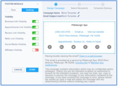
Note: You
can change the Affiliations that appear in the Footer Module by navigating
to & clicking Edit on the Business Information page of the portal
in Settings.
2. Click
Done.
To
use the Custom HTML module

1. Move
your mouse over the Custom HTML Module, and click the pencil icon
to open options.
2. Copy
and paste, or type in the HTML code you want to display in the module
on the right.

3. Use
the Custom Tags menu to paste
in practice information that will auto-generate for each recipient.
Note: The
HTML code that you enter in the right-side panel will render, as it appears
to recipients, within the right-side module.
4. Click
Done.
For additional information about HTML and Campaign
Studio, see HTML
Template Guidelines for Campaign Studio.